Threefold Letter
Issue 02

Welcome to the Threefold Letter. A monthly edition: it unfolds like a concertina book laying out three pages, each with something I’ve been thinking about, reading about, or something I’ve been working on.
---fold here---
Botanical dyes and makings
My garden is spotted with bright orange suns, marigolds. They cluster in the corners attracting and confounding white fly and carrot moths away from the other plants. I regularly winnow out the blooms which have shone the longest into a bag in the freezer. The flowering is prolific. After a month of amassed orange, it was time to test them out as a dye on a cotton silk fabric. And the result is striking.


This time of year, my mother is hard at work at the stove, trying to keep up with orders for her piquant preserves in time for Christmas markets. Onion skins filled my large dye pot, and they simmered on an old gas stove outside for hours enroute to becoming paper. The paper is a creamy white ochre, with tiny threads of onion skin. Garlic skins are following suit. Watch this space for onion skin paper with botanical ink prints.
---fold here---
Visits to the Archive
This month took me on several guided tours of archival collections: treasures of print, paper, and binding. The Association of Book Crafts and the Association of Handcraft Printers held their annual Wayzgoose in Wellington this year. The event included visits to the Te Papa Library and the Alexander Turnbull Library (Te Puna Mātauranga o Aotearoa).
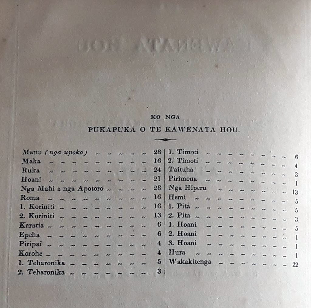
A highlight at Te Papa was Ko Nga Pukapuka o te Kawenata Hou, Printed by the Church Missionary Society in 1837, which means it was printed by William Colenso. This is Colenso’s own copy, bequeathed to the museum in 1899. I was surprised at the significant ‘bonk’ of the printing. Bonk refers to the push through of the type on the verso of the page. It seems the term hasn’t made it into many printing glossaries, but it’s in common usage in our print shop.
Bonk is different to impression. The tactility of impression is on the front side of the page, where you might be able to feel the debossing of the paper which is been compressed by the pressure of the type. If the paper is thick, there will be little to no sign of this debossing on the reverse side. Bonk, however, is the tactility on the reverse, where the type has pushed though. As a printer, I largely regard it as undesirable. But Colenso was working with a Stanhope press; using decent pressure to get a good print would have been inevitable. Avoiding the push through would not have been a printing priority. It was a reminder that the distaste for bonk probably came later, when electric powered presses enabled a softer touch, and that there are many measures for what makes fine printing!
At the Turnbull, we saw so many fascinating books from the collection, and if you’re in the area, I strongly recommend requesting a viewing of rare books with curator Anthony Tedeschi who is a masterful storyteller of the collection. I’m hard-pressed to choose a single highlight of this visit, after all, we saw a page from the Gutenberg bible, a book printed at the South Pole, and Shakespeare’s Second Folio. So instead, my highlight is the interweaving of the collection in its acts of collecting and coming together and the spaces in between the volumes in which they breathe and interact as a collection.
Closer to home, last week I visited the Tāmaki Paenga Hira (Auckland Museum) Library. This tour of treasures was more tightly curated to my interests and included a collection of bookplates, nature printing (including an Eric Craig / Herbert Dobbie blue book), and a Dard Hunter folio Primitive Papermaking, a beautiful sample collection of tapa cloth techniques and materials from all around the Pacific. It is an incredible repository of knowledge and skill of papermaking in Moana-nui-a-kiwa. It’s easy to get your back up at the ‘primitive’, given how prolific and accomplished the papermaking was and is. But the reverence Hunter shows throughout the folio somewhat makes up for the verbal slight on the cover. Another rich and exciting piece was Koe Higoa Haaku Hiapo, a poem by Jessica Pasisi printed on hand-beaten hiapo bark cloth made by Cora-Allan Wickliffe, and illustrated by Wickliffe with mangrove bark extract and burnt tuitui nut handmade ink pigments.
---fold here---
Out in the World
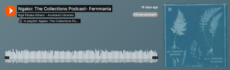
A few months ago, I was invited to visit the Auckland Central Library to chat about the Herbert Dobbie / Eric Craig blue books – blueprint/cyanotype fern books made in the nineteenth century which document the ferns of Aotearoa. These books have had a large influence on how I think about fern and nature printing and about Pākehā ideas of belonging. The blue books are another element, alongside silver ferns, of our obsession with ferns, our long-lived fernmania, tied up with our Pākehā identity of imagined homecoming in Aotearoa. Benj and Sue at the library asked me to bring along some of my own nature print books to act as a touch point to ways of creatively interacting with library collections. The treasures in archives are wonderful places from which to launch creative endeavours. That thoroughly enjoyable chat has been edited down and paired with Renee Orr’s knowledgeable discussion of the blue books themselves into a wonderful podcast. You can find it here: https://on.soundcloud.com/bVLzf